11 Reports To Analyze When Redesigning Your Website
- Nick Eubanks

- Jan 9, 2019
- 5 min read
Updated: Apr 3, 2025
Web design isn't just colors and fonts - it's form, function and usability.
Tools like Google Analytics hold hidden gems to inform us about what the proper form and function of your website should be.
By mining the right data, we can understand exactly how to improve a website's architecture, layouts and design styles.
In this post, I'm going to run you through the 11 analytics reports our consultants analyze to begin the a website redesign for clients.
Want deeper insights? Watch the video????
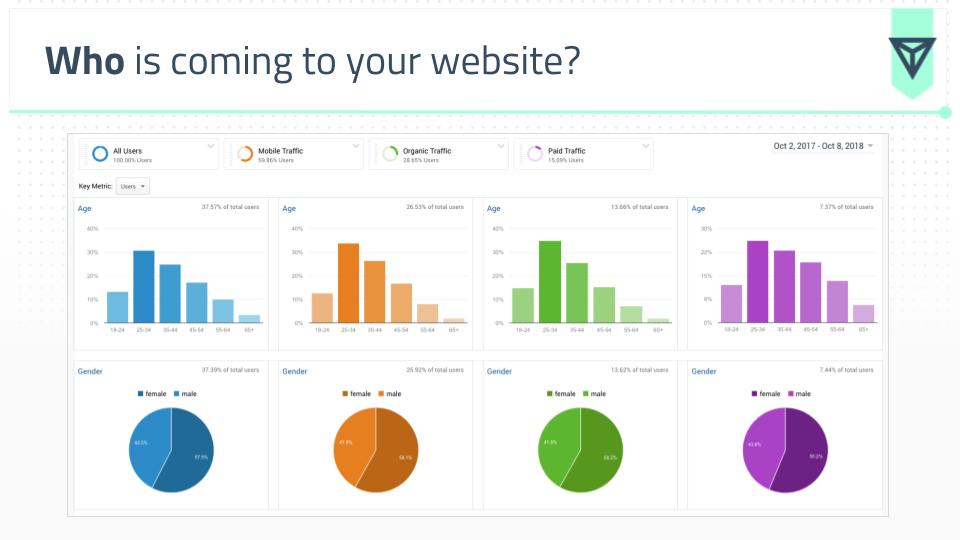
1. Age, Gender and Demographics
Tool: Google Analytics
Report: Audience -> Demographics -> Overview
Segments: Mobile, Paid, Organic
Insights: Learn WHO is coming to your website by age and sex. This data can help inform decisions about website imagery, messaging, tone, copy and architecture. If you skew young vs old (or male vs female), it should dictate how your website communicates. The additional segmentation for device and traffic type helps to drive more understanding for how those groups are accessing your website.
2. Country and City
Tool: Google Analytics
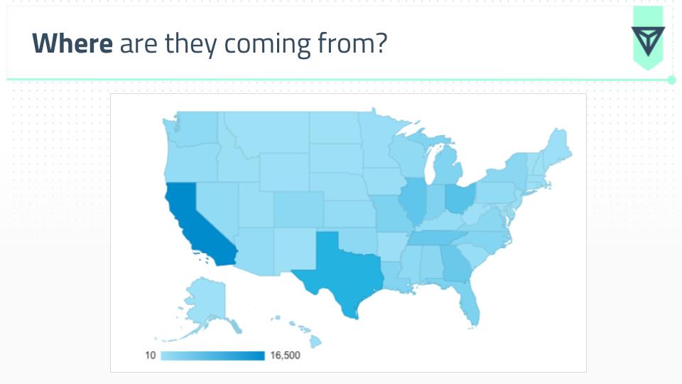
Report: Audience -> Geo -> Location
Segments: City
Insights: Make a decision about adding an additional language, translation or geo targeted content to your site. If you are a local business, this can also help you determine if you need to create geo fenced landing pages for each of your physical locations.
3. Device Breakdown
Tool: Google Analytics
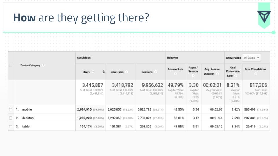
Report: Audience -> Mobile -> Overview
Segments: Traffic Source
Insights: Helps to inform how to begin your design process, whether you begin with “mobile first” layouts or traditional desktop. While the industry may have you believe everything is mobile first, there are plenty of industries (marketing for one) that do significantly more traffic on desktop. ALWAYS consult your data before making decisions.
4. Traffic Source Overview
Tool: Google Analytics
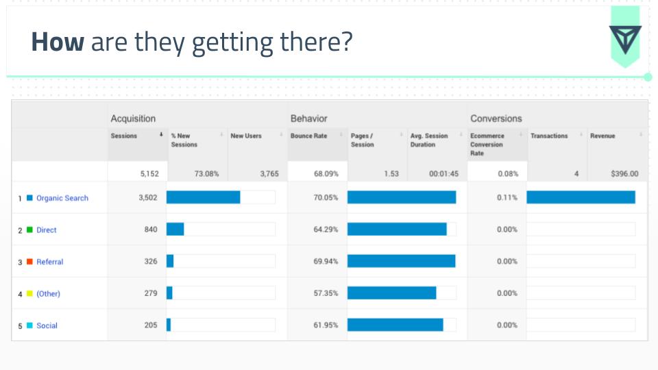
Report: Acquisition -> Overview
Segments: Mobile
Insights: Understand how people are accessing your website. At a high level, this begins the conversation of the type of content we want to build the site around.
5. Landing Page Analysis
Tool: Google Analytics
Report
: Behavior -> Site Content -> Landing Pages
Segments: Secondary Dimension -> Source / Medium
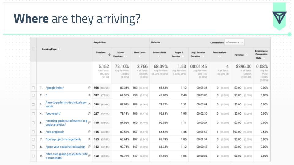
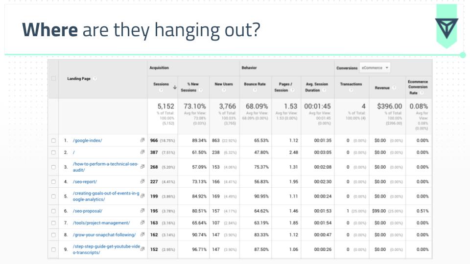
Insights: Helps you to understand the most popular entry pages on site cross-walked by engagement metrics. There’s a TON of insight you can get from this report alone:
% New Sessions - by understanding which page types attract new traffic vs returning, we can better dictate the TYPE of content on that page. For example, a blog post generally has a higher % of NEW sessions. This means we’d need to design that page template to clearly communicate what the brand is / does for people with no context.
Bounce Rate - measures the% of people who arrive to your site and leave without visiting another page. This can help you understand (at a high level) the quality of that landing page and if you need to revisit content, messaging and layouts.
6. Content Drilldown
Tool: Google Analytics
Report: Behavior -> Site Content -> Content Drilldown
Segments: None
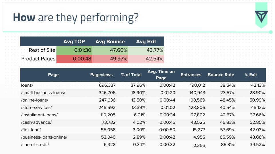
Insights: This report is different than the previous as it shows pageviews as opposed to page entries. This is important because we can truly dig into the quality of a page through looking at 3 metrics:
Bounce Rate - mentioned above what this metric is and why it's important.
Exit Rate - the % of times visitors leave the site through that page. This is different than bounce rate because this metric only measures sessions with multiple page visits. This helps us understand if key landing pages (i.e. a service page, ecommerce page) is delivering on what the visitor needs. A high Exit Rate on key pages would point to issues with page quality, as conversions should be taking place here.
Avg Time on Page - tells you how long visitors spend on that page on average. It's important to look at bounce rate in conjunction with this metric, as a visitor could "bounce" but spend 20 minutes on that page consuming all the content.
7. Key Landing Page Performance
Tool: Google Analytics
Report: Behavior -> Site Content -> Landing Pages
Segments: Download the data and use Excel to segment pages
Insights: By pulling out the URLs of key landing pages (i.e. service pages, ecommerce pages) we can compare the performance against the rest of the pages on the site. Key landing pages should have higher metrics than the rest (generally speaking).
8. Conversion Analysis
Tool: Google Analytics
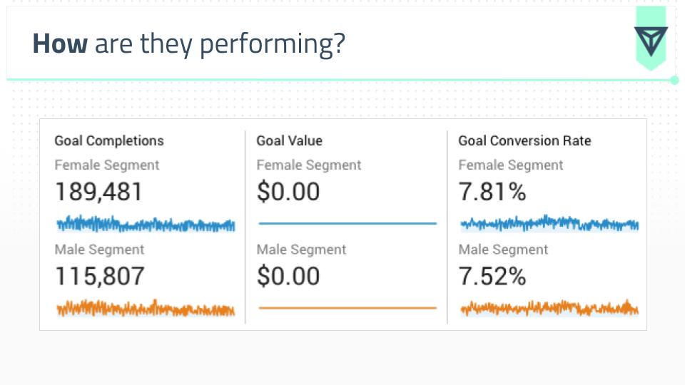
Report: Conversions -> Goals -> Overview OR Conversions -> eCommerce -> Overview
Segments: Age, Gender, Mobile
Insights: The breakdown of who the most valuable visitors to the website are. This can help inform decisions about key conversion elements like forms and sales copy.
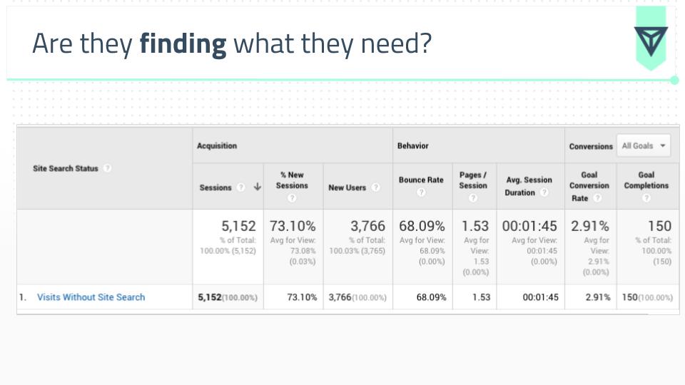
9. Internal Site Search
Tool: Google Analytics
Report: Behavior -> Site Search -> Overview
Segments: None
Insights: If visitors are using internal searches to find what they are looking for, this can inform aspects like content mapping and website architecture to put key pages in more visible places.
10. Pathing Report
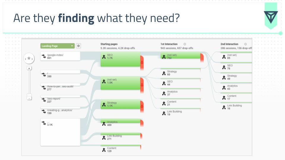
Tool: Google Analytics
Report: Behavior -> Behavior Flow
Segments: Mobile
Insights: Use this report to see how visitors are pathing through the site. This should help to inform elements like navigation to create a flow towards conversions and goals.
11. Heat Mapping
Report: N/A
Segments: N/A
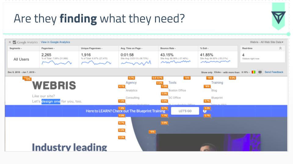
Insights: Since most websites aren't using heat mapping tools, this free plugin gives you a crude idea of how visitors are behaving on a given page. I like to use this information to dig out what visitors are really looking for on certain pages. This helps to inform in page elements to add or remove (i.e. internal links, accordions, tiles, etc).
Putting Insights Into Action
I want to run you through a recent client example to show you how we can translate data into concrete design practices. While I can't give you the client name, I can give you context on their business:
The client: A large national loan provider with hundreds of store locations.
The problem:
The solution: A full website redesign.
Slides 20 through 37 in the presentation deck below are the exact insights and design patterns we created for the client based on the same data analysis outlined above.
Just to drive it home, I want to show you how we take these insights at a granular level and turn them into custom elements.
Navigation
Data insight:
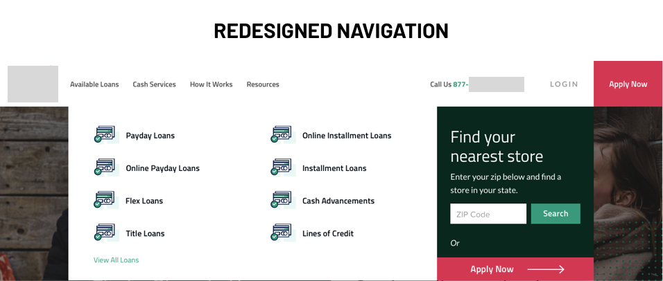
Key service pages are not getting pageviews because they are hidden in the footer. The current top level navigation only displays 2 service pages, we should create a mega menu design to facilitate all services into the top level.
Design Element:
Mega menu top level navigation

To view more of the insights in action, check out the full before and after designs of the home page (CLICK to view entire image).
Before

After
